Tool Is Certified by Microsoft:

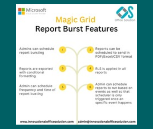
For more information visit our Microsoft app source link https://appsource.microsoft.com/en-us/product/web-apps/officesolution1640276900203.magic-grid-pbi-report-bust-solution?tab=Overview
Office Solution Capacity Monitoring tool enables organizations to track Centrally:-
A quantile dot plot is a powerful visualization tool that represents t
The Fishbone Chart, also known as an Ishikawa or cause-and-effect diag
Empower users with dynamic bar charts, allowing real-time numeric aggr
Dynamic Price Elasticity Heat Map
Supply Chain Network Flow Chart
The Barley Trellis chart, inspired by Becker et al.'s groundbreaki
Transform your Bar Chart into a dynamic Scatter Plot for enhanced data
Cohort Chart