Product Detail

Lorenz Curve Chart

Tool Is Certified by Microsoft:

Problem Statement

The Equality Line is a 45-degree line representing perfect income equality, while the Lorenz Curve shows actual income distribution, typically bowing below it to indicate inequality. Cumulative Population Share and Cumulative Income Share represent the distribution of income among the population. The Lorenz curve is a powerful tool for visualizing and understanding income inequality.

Challenges

To read the Lorenz Curve, start at the origin (0,0), where 0% of the population holds 0% of the income. As you trace the curve, observe the cumulative income distribution (e.g., 50% of the population owning 20% of the income would pass through (50, 20)). Compare this curve with the Equality Line, which represents perfect equality. The farther the Lorenz curve is from this line, the greater the inequality. A curve that matches the equality line indicates no income inequality.

Conclusion

Conclusion The Lorenz curve is a powerful tool for visualizing and understanding income inequality. By plotting the cumulative share of income against the cumulative share of the population, it provides a clear picture of how evenly or unevenly income is distributed in a society

Premium

The Premium version includes features like Logo Removal, a Dropdown for selecting specific data (e.g., year or country), Top n Selection based on income/wealth, and interactive tools like Zoom and Horizontal/Vertical Line controls. These enhancements support policy-making by aiding in equitable income distribution and economic studies by allowing detailed analysis and comparison of income distributions across regions and time periods.

Other products

Office Solution Capacity Monitoring tool enables organizations to track Centrally:-

Spiral Plot Chart

The Spiral Plot by Office Solution offers a unique way to visualize da

HR_Analytics

Barley Trellis chart

The Barley Trellis chart, inspired by Becker et al.'s groundbreaki

Demand Planning

Bar Chart With Export

Empower your data analysis with our Bar Chart featuring export capabil

Stacker Bar Chart With Top N

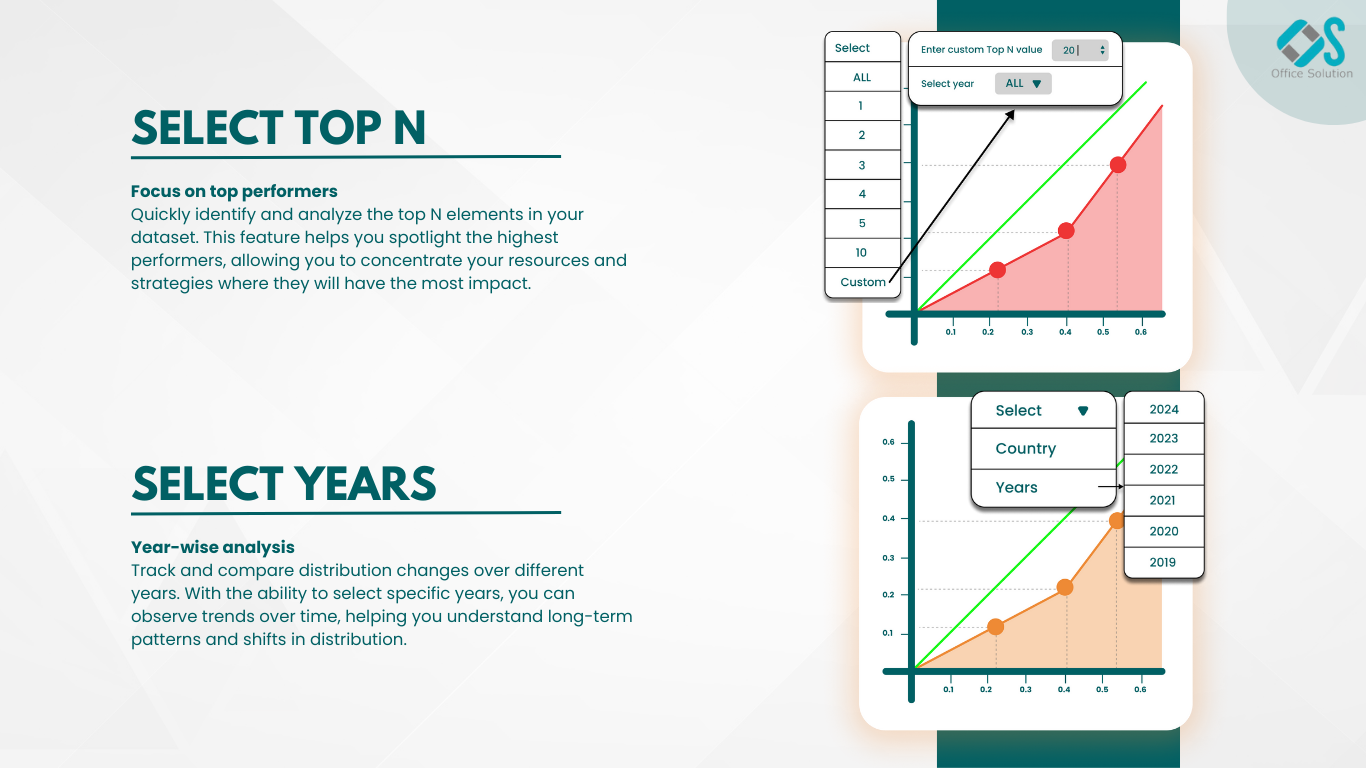
Select Top N number of items to be displayed in chart and rest items w

Line With Bubble Chart


Magic Grid PBI Report Burst Solution

The Magic Grid PBI Report Burst Solution is a Power B