Tool Is Certified by Microsoft:


For more information visit our Microsoft app source link https://appsource.microsoft.com/en-ie/product/power-bi-visuals/officesolution1640276900203.line-bubble-chart-by-office-solution?tab=Overview
Office Solution Capacity Monitoring tool enables organizations to track Centrally:-
The Fishbone Chart, also known as an Ishikawa or cause-and-effect diag
The chart you are working with is designed to provide users with power
Supply Chain Network Flow Chart
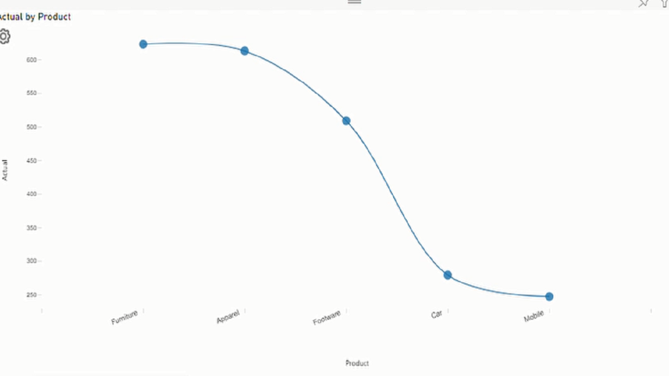
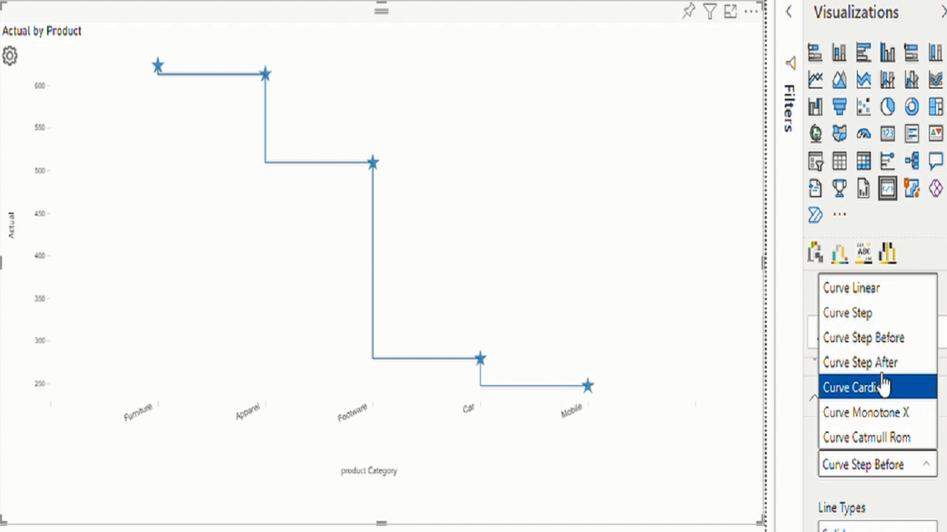
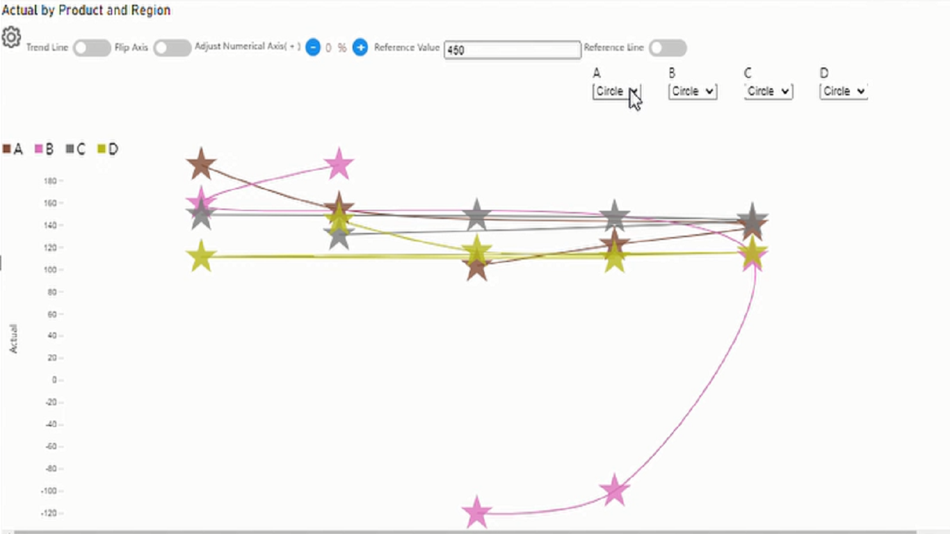
Experience the versatility of Line and Scatter Plot Chart, where you c
Dynamic Price Elasticity Heat Map
The Hanging Rootogram chart is an advanced statistical visualization t
Empower your data analysis with our Bar Chart featuring export capabil
Cohort Chart