Tool Is Certified by Microsoft:

For more information visit our Microsoft app source link https://appsource.microsoft.com/en-us/product/power-bi-visuals/officesolution1640276900203.fish-bone-chart-for-power-bi?tab=Overview
Office Solution Capacity Monitoring tool enables organizations to track Centrally:-
A profit and loss statement summariz
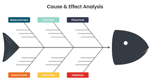
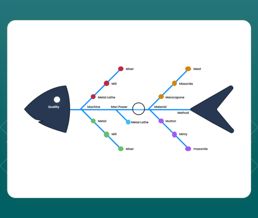
The Fishbone Chart, also known as an Ishikawa or cause-and-effect diag
Cohort Chart
Experience the versatility of Line and Scatter Plot Chart, where you c
The Magic Grid PBI Report Burst Solution is a Power B
Empower users with dynamic bar charts, allowing real-time numeric aggr
Sales Velocity Chart