Tool Is Certified by Microsoft:

For more information visit our Microsoft app source link https://appsource.microsoft.com/en-us/product/power-bi-visuals/officesolution1640276900203.bar-chart-with-dynamic-range-creation
Office Solution Capacity Monitoring tool enables organizations to track Centrally:-
Calendar Chart
Custom Tree View and Bar Chart, offering flexibility in managing column width and height, along w
The Spiral Plot by Office Solution offers a unique way to visualize da
Power BI Premium Capacity Analytics Solution Reduce your Power BI prem
The Circular Dendrogram Chart offers a unique and vis
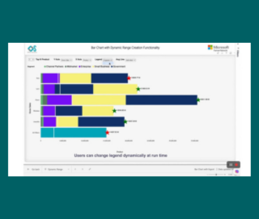
The chart you are working with is designed to provide users with power